In the vibrant world of branding and design, every element is meticulously crafted to evoke specific emotions and reactions from the audience. Among these elements, color stands as one of the most powerful tools in a designer’s arsenal. At our world-renowned branding and design agency, we understand that color is not just about aesthetics; it’s about psychology. Let’s delve into the fascinating realm of color psychology and explore how it shapes effective branding and design.
The Science of Color Psychology
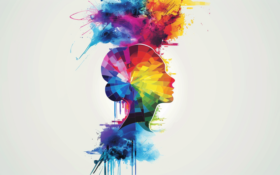
Color psychology is the study of how colors affect human behavior and perception. It’s rooted in the understanding that colors can influence our emotions and decisions, often subconsciously. This science is crucial in branding because it helps create a visual identity that resonates with the target audience and communicates the brand’s values and personality.
The Emotional Spectrum of Colors
- Red – Passion and Energy: Red is a color of excitement, passion, and urgency. It’s often used in branding to grab attention and evoke strong emotions. Think of brands like Coca-Cola and Netflix; their use of red creates a sense of energy and passion.
- Blue – Trust and Serenity: Blue is associated with trust, calmness, and professionalism. It’s no wonder that many financial institutions and tech companies, such as PayPal and Facebook, use blue to convey reliability and stability.
- Yellow – Optimism and Warmth: Yellow exudes happiness and warmth. Brands like McDonald’s use yellow to evoke a sense of friendliness and optimism, creating an inviting atmosphere.
- Green – Growth and Harmony: Green is synonymous with nature, health, and tranquility. It’s a popular choice for brands related to the environment, wellness, and finance, like Whole Foods and Starbucks, as it conveys growth and balance.
- Purple – Luxury and Creativity: Purple has long been associated with royalty, luxury, and creativity. Brands like Cadbury and Hallmark use purple to evoke a sense of elegance and imaginative thinking.
- Orange – Enthusiasm and Innovation: Orange combines the energy of red and the cheerfulness of yellow. It’s used by brands like Fanta and Amazon to convey enthusiasm and a forward-thinking approach.
- Black and White – Sophistication and Simplicity: Black and white are timeless and versatile. Black conveys sophistication, elegance, and power, making it a favorite in luxury branding (e.g., Chanel). White, on the other hand, represents purity and simplicity, often used in minimalist and clean design aesthetics.
The Strategic Use of Color in Branding
When developing a brand identity, choosing the right color palette is crucial. Here’s how we at our agency approach color selection strategically:
- Understanding the Brand’s Personality: We start by deeply understanding the brand’s core values, mission, and personality. This foundation guides our color choices to ensure they align with the brand’s essence.
- Target Audience Analysis: Different colors resonate with different demographics. For instance, younger audiences may respond more to vibrant and bold colors, while older demographics might prefer more subdued tones. Knowing the target audience helps in selecting colors that appeal directly to them.
- Competitive Landscape: Analyzing competitors’ color schemes helps in identifying opportunities to differentiate the brand. We aim for a unique color palette that stands out in the market while staying true to the brand’s identity.
- Cultural Context: Colors can have different meanings in different cultures. For global brands, it’s essential to consider these cultural connotations to avoid miscommunication and ensure the brand is perceived positively worldwide.
The Role of Color in Graphic Design
In graphic design, color is not just about choosing a palette; it’s about creating a cohesive and impactful visual experience. Here’s how we integrate color psychology into our design process:
- Hierarchy and Emphasis: Colors help create a visual hierarchy, guiding the viewer’s eye to the most important elements. Using contrasting colors can highlight key information and calls to action.
- Brand Consistency: Consistency in color usage across all brand touchpoints reinforces brand recognition and loyalty. We ensure that the chosen colors are applied uniformly in logos, marketing materials, and digital platforms.
- Emotional Connection: By leveraging the emotional impact of colors, we design visuals that resonate with the audience on a deeper level. Whether it’s evoking excitement, trust, or serenity, the right colors enhance the overall message and feel of the design.
- Accessibility: Inclusive design is paramount. We ensure that color choices consider accessibility standards, making sure that all audiences, including those with color vision deficiencies, can engage with the brand effectively.
Conclusion
Color is a fundamental aspect of branding and design, with the power to influence perceptions, emotions, and behaviors. At our agency, we harness the psychology of color to create compelling brand identities and designs that not only stand out but also connect meaningfully with audiences. By understanding and strategically applying the principles of color psychology, we help brands communicate their essence and forge lasting impressions in the minds of their customers.
So, next time you see a brand that captivates you, remember—there’s a good chance that the magic lies in the colors they’ve chosen.
If you’re looking to elevate your brand through the power of color and design, get in touch with our expert team. Let’s create something extraordinary together.